
This plot shows the decline of individual fields on top of the overall production curve, which essentially provides a compact and instructive look at trends.
I asked a follow-up question at TOD referring to the possibility of similarly plotted graphs for oil fields. Sure enough, another commenter pointed out a UK study (PDF) which contained that kind of plot for North Sea oil. Apparently, the UK requires very detailed reporting of yearly production so the plot comes out quite clearly (click below for expanded view).

But another commenter pointed out that this data only extended to the year 2000, with only an extrapolation given for the ensuing years. So I offered up data to extend the profile to 2005.

Stepback then craftily combined the two sets of data, and voila:
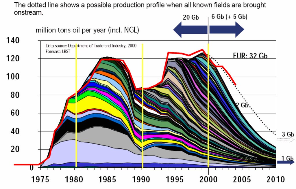
The red line indicates the updated data trend (corresponding to the yellow dots). Click to expand.